Pragun Agarwal
My final project at the Maryland Institute College Of Art for the Graphic Design MFA investigates the positive role of an experience in today’s world and as a potential tool to consider while approaching a design problem. By taking upon the role of a curator, planner and designer, I looked at the format of a festival/conference/event to provide a platform for the Asian and middle-east design community working in the USA. This provided these designers an opportunity to share their unique insights and connections between their culture and their work.
Titled Toast—International Design Festival, The event took place on 15 February 2019 for the Graphic design community at MICA.
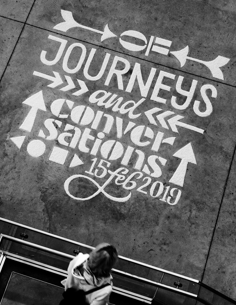
Rice installation or ‘Rangoli’ done through a collaborative exercise as a promotion for the event.
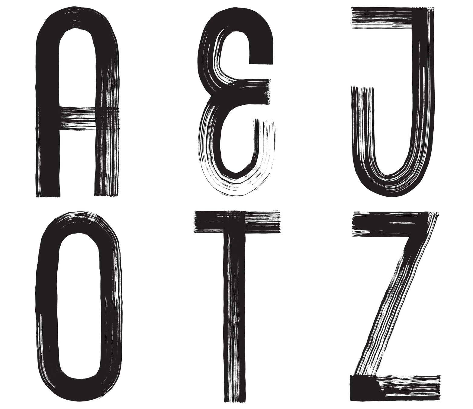
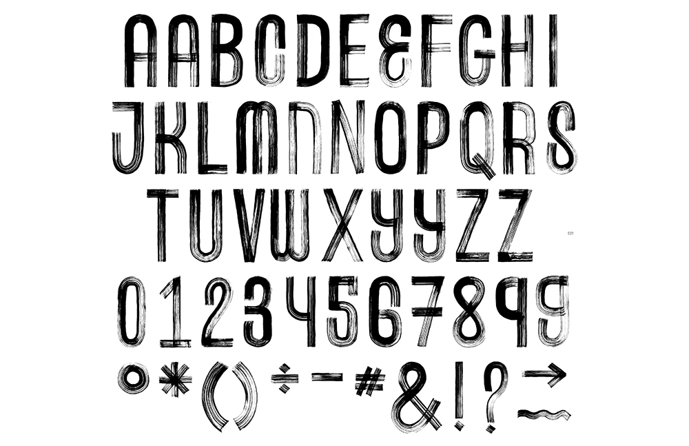
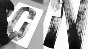
I used foam brushes and ink to mimic the same aesthetic that I was able to craft while drawing with an actual piece of toast. These letterforms reflected a path that was unique and reflected the idea of a journey. I created a display typeface using this tool that ultimately became the core element across all my brand applications.
As this was a hand-drawn typeface, I was able to create contextual alternates for several characters. This was an efficient tool to break the monotony and still retain the genuineness that comes from hand-crafting letterforms.
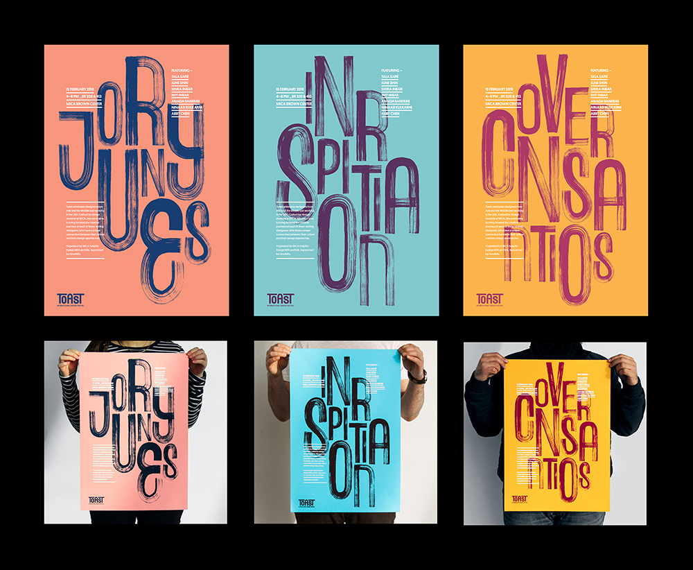
As a designer, I am fascinated my analog processes and mediums. I screen-printed two colour posters that were hung across the space. The posters showcased the words 'Journeys', 'Inspiration' and 'Conversations'.
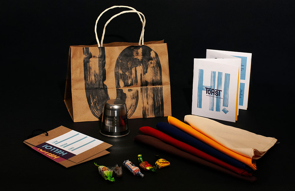
Takeaways are essential artifacts at any event or festival. As a host for Toast–International Design Festival, I designed a number of different items for all the attendees. I put together a hundred of these bags .These items live on even after the event, in people’s houses and memories. Each element was carefully planned and created by me to give the attendee an insight into different materials, textures, cultures and contexts.
Highlights and key moments from the event.
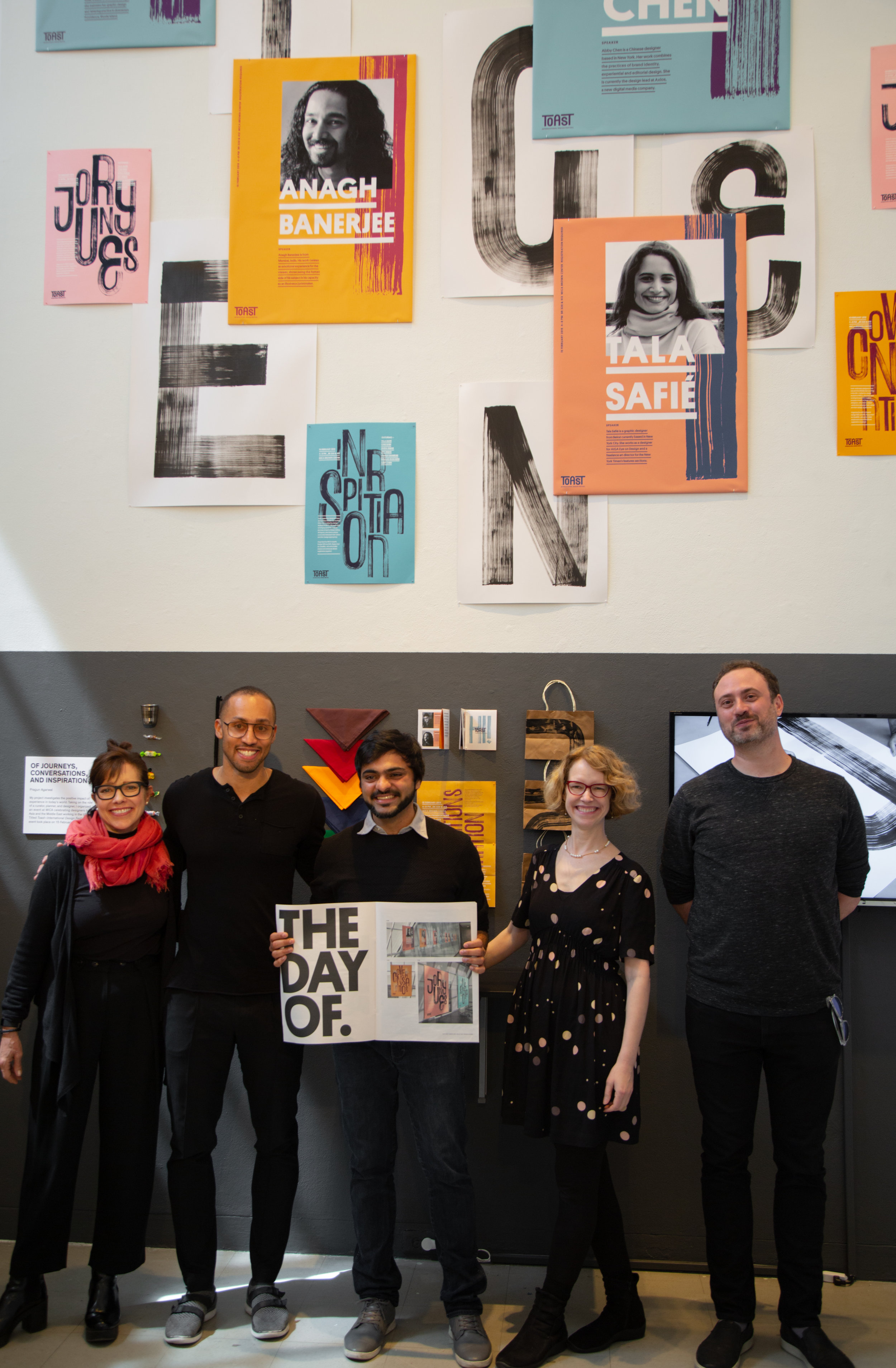
As the element of scale was so crucial to my installation, I crafted larger letterforms for my thesis exhibition. By using an industrial sponge, I was able create a much larger set this time. I also included a process video for the viewers to understand this technique.
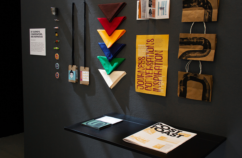
The videos, images, posters and publication came together as a package to exhibit my project in a more cohesive manner.