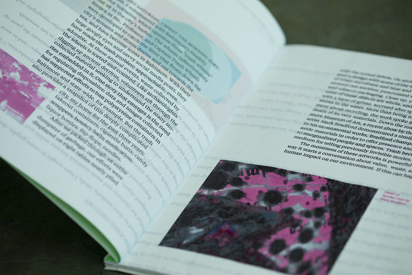
Trash is Design
Katie Mancher
All design will eventually become trash, and trash makes way for new design. In trash, however, there is value. This project explores that value through a body of experiments incorporating waste into design and principles for rethinking waste. Trash is a record of the life of an object—its origins, process, use, and impact, the things the designer can and cannot control—and therefore represents what is most human about design.
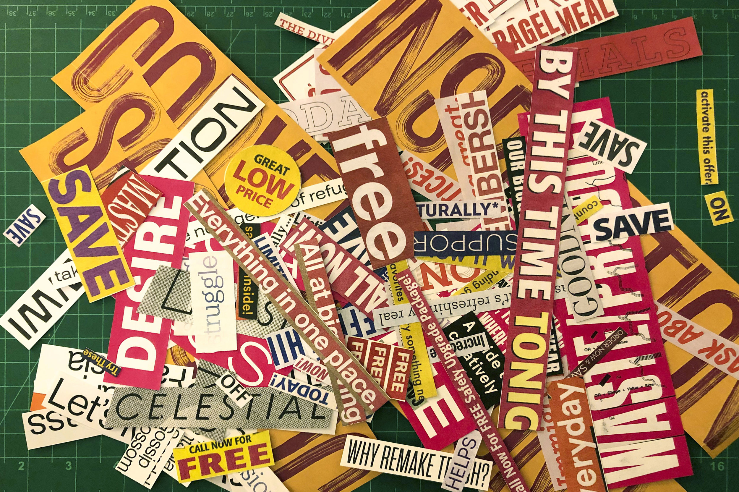
Scraps
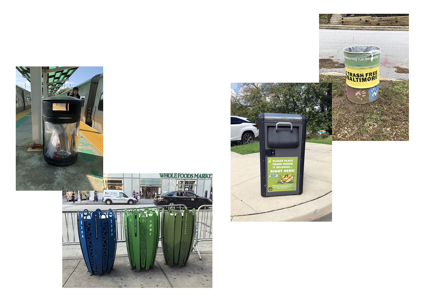
Trash is everywhere, but most of the time we are trying not to see it. Much of my research involved just seeing the trash around me: how we sort it, talk about it, design it, or don’t. I wanted to understand the place trash holds in our culture, how designers are currently dealing with it, and what we can do better.
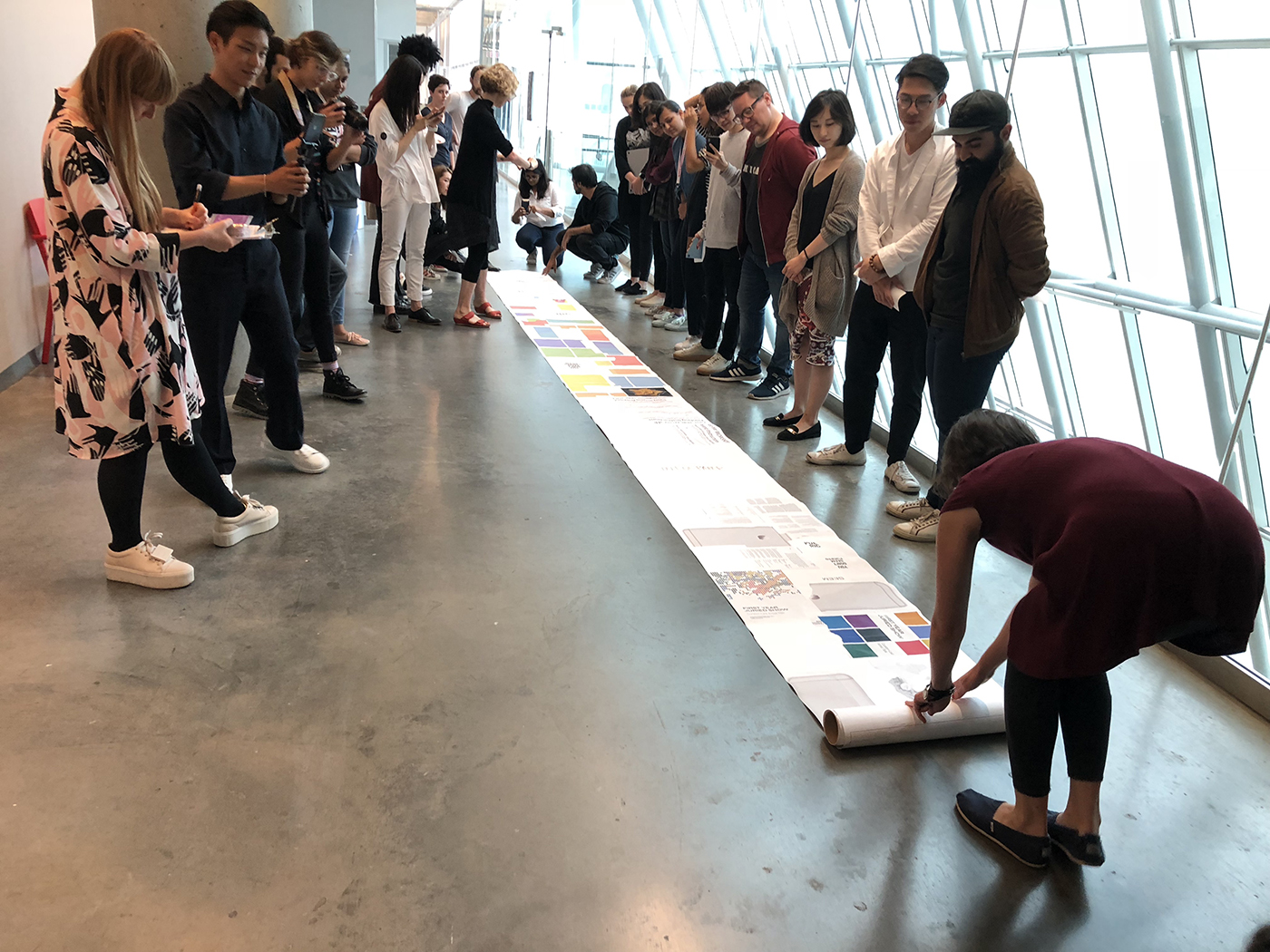
Workshop with The Rodina
I wanted to find a way to show the amount of trash we throw away but never see in totality. During this weekend workshop, I collected paper from the studio recycling bins and glued it together into a new paper roll. I then performed by unrolling it down the hallway in front of all my peers.
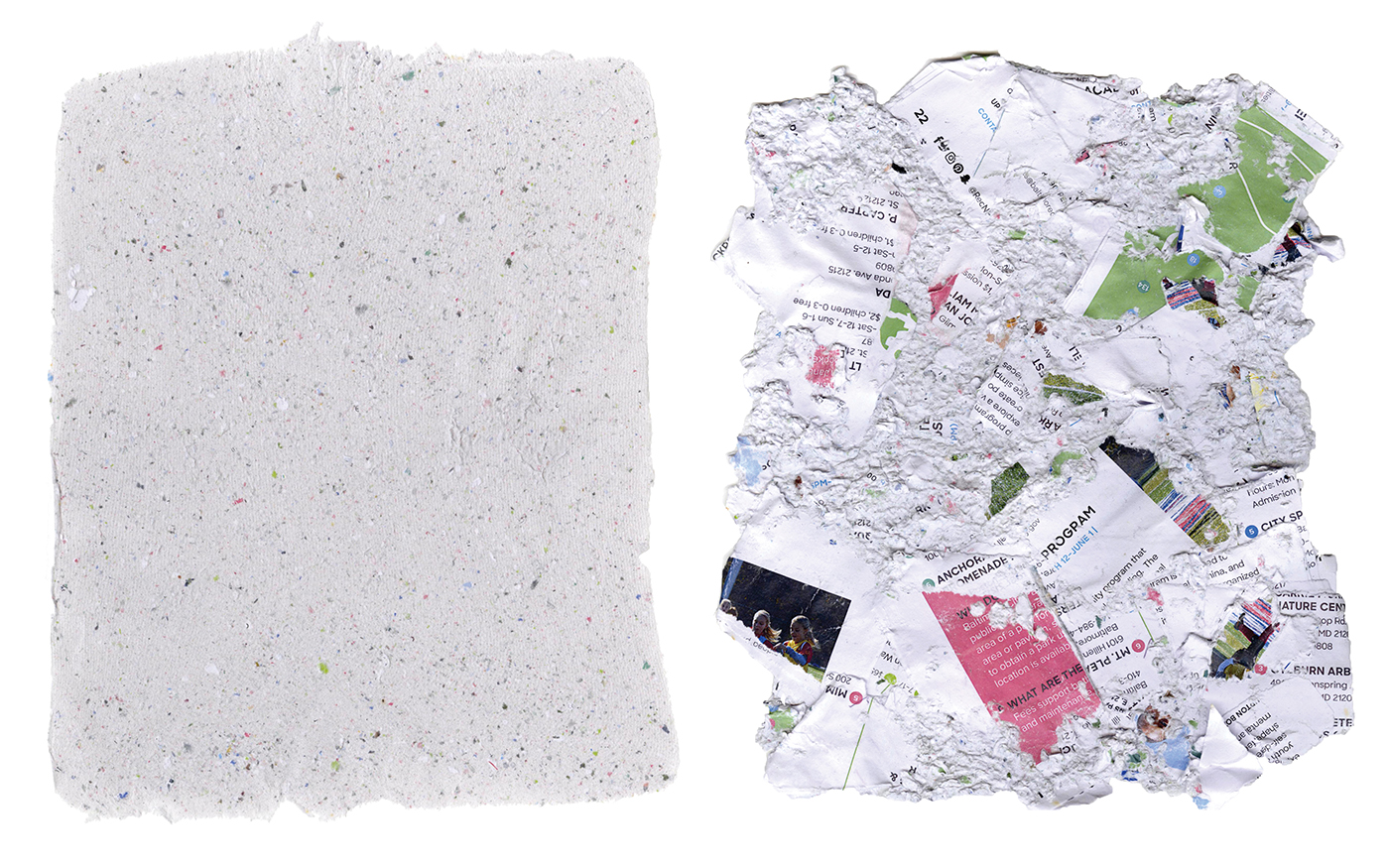
Recycled paper
I experimented with various methods of reusing paper waste, including making it into pulp and making my own recycled paper out of it.
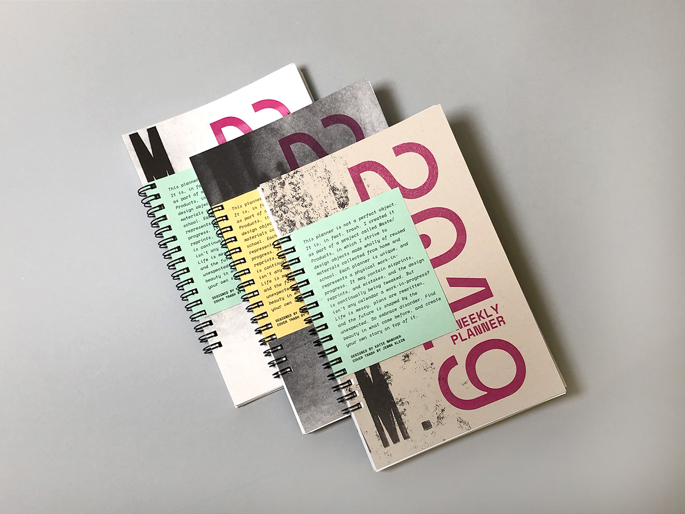
Branding Trash
I designed these planners to be printed on recycled paper from the studio. I explored the idea of creating a brand that sold practical products made from trash, and that could engender a more positive image of trash.
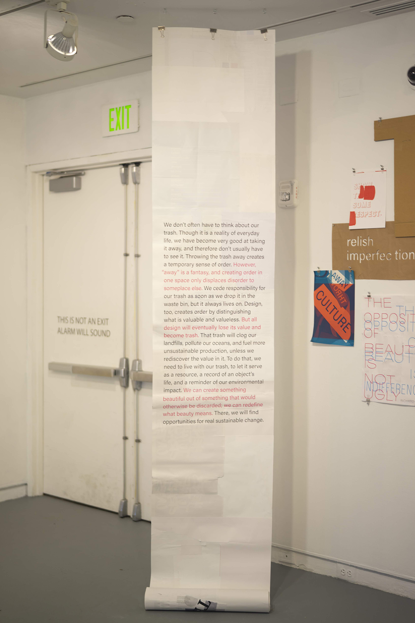
Manifesto
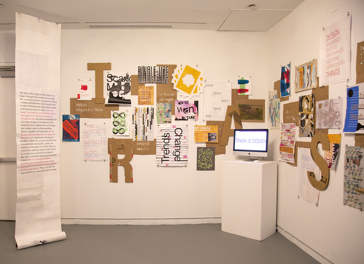
For the exhibition, I printed this “trash manifesto” on a re-assembled roll of recycled paper, like I had created for the Rodina workshop. It was hung away from the wall so viewers to see the paper from both sides.
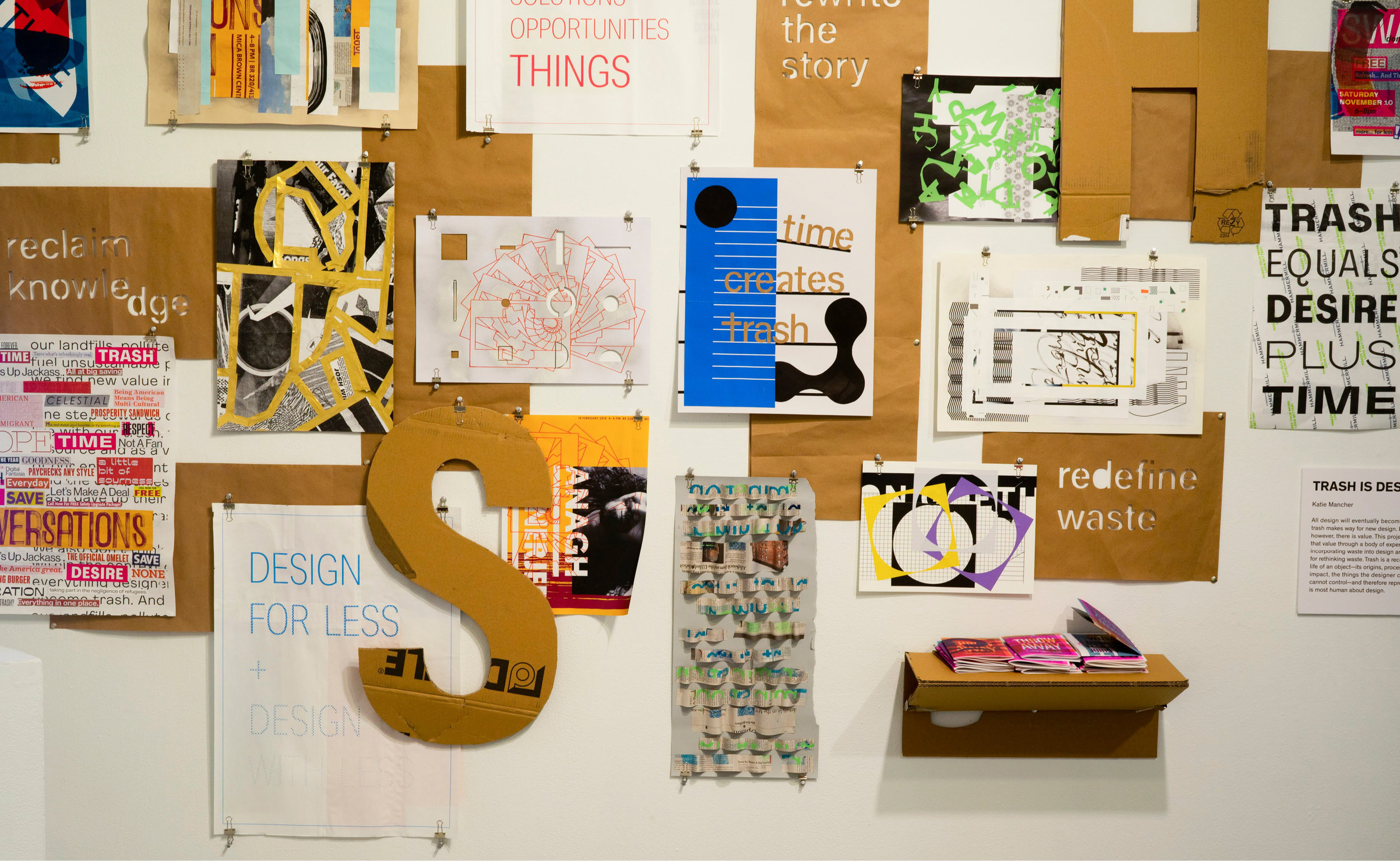
Exhibition details
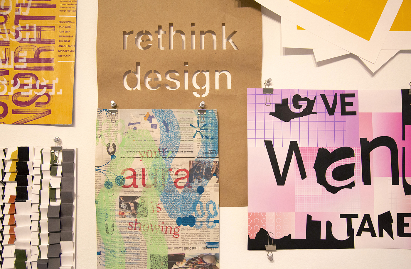
In exhibiting my thesis, my goals were to make work with all studio-sourced trash materials, to engage viewers in an experience and an interaction that would make them see trash differently, and to leave as small an impact as possible. The work was hung with pushpins and binder clips, a nod to the temporary nature of the exhibition.
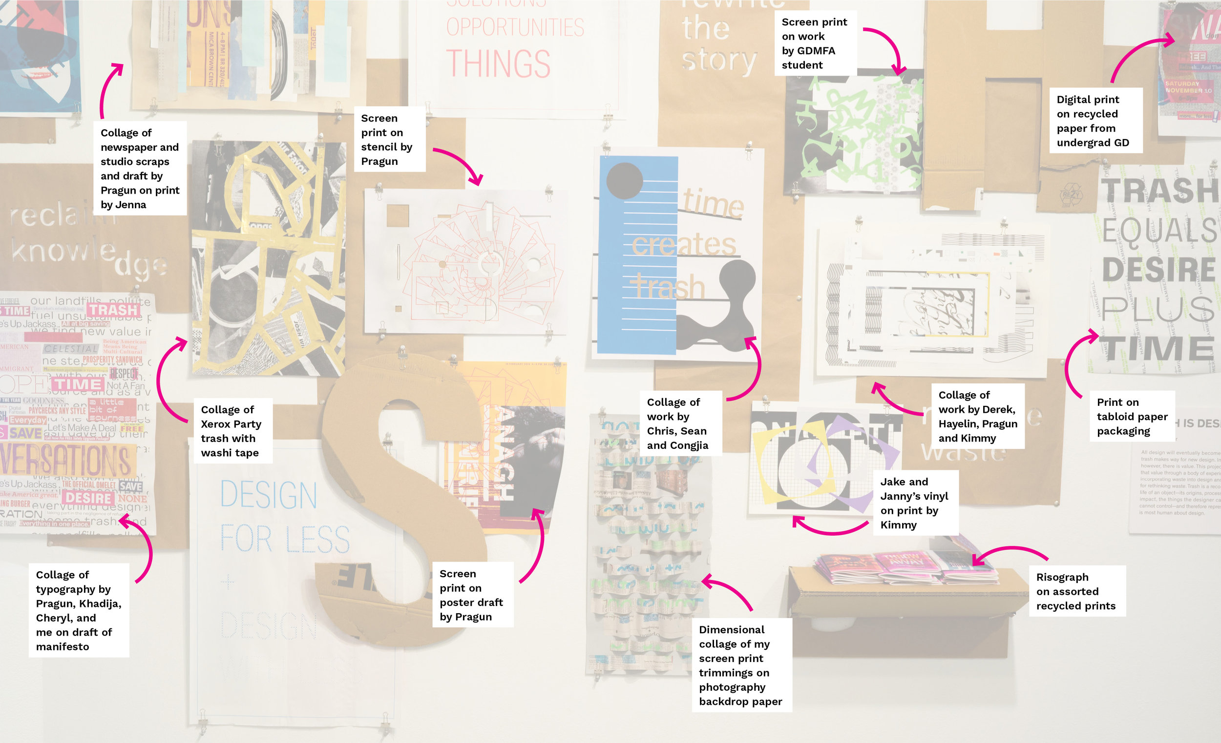
Each piece in the exhibition was made from recycled materials collected in the studio, much of it my fellow students’ thesis waste. I consider them collaborators in this project.
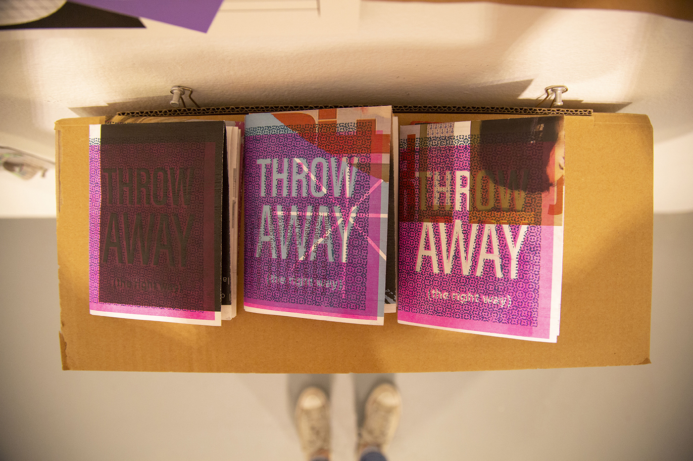
Takeaway
If I was going to make an exhibition takeaway, it was important for me that it be something useful that did not become trash right away. I decided to adapt the recycling charts I made for the studio early in the year. I was happy to see people taking these, and was especially happy to hear they learned something about what is recyclable or not. I printed the pamphlets with a risograph on top of recycled paper that was used on one side, and designed them accordingly.
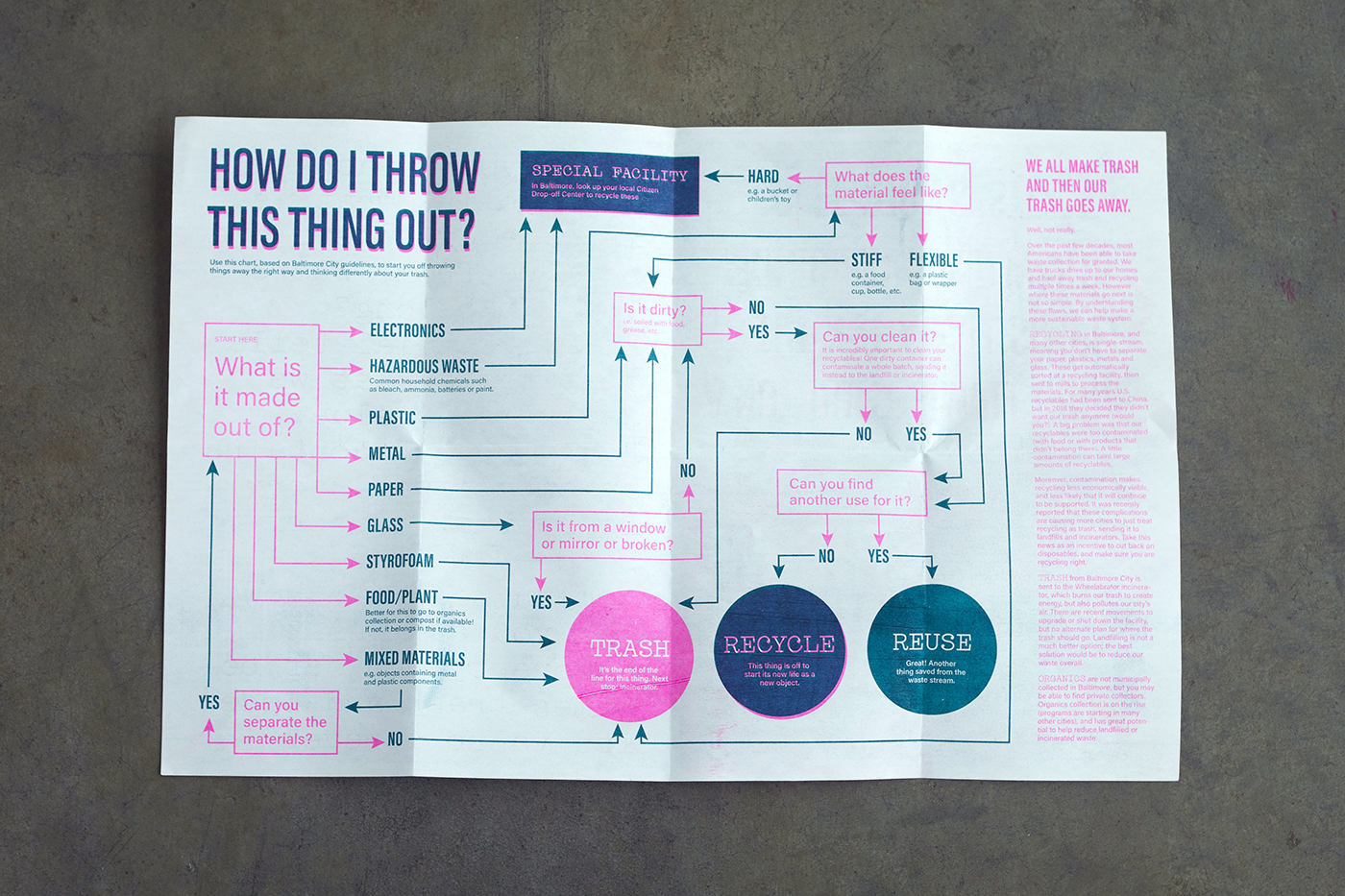
Recycling mistakes can cause whole batches of material to be contaminated and the value of recycling to decrease. Therefore improving knowledge about how to recycle properly presents a huge opportunity. I designed this recycling chart for to help people navigate the complexities of the waste collection system.
Digital Exploration
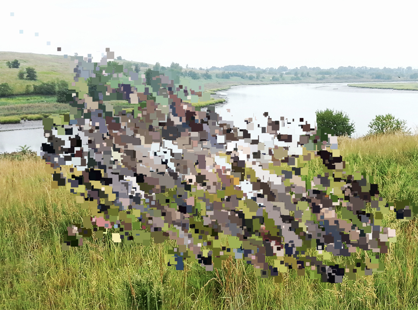
Beyond physical materials, the concept of reusing or remaking is not as obvious. However I have sought to explore how digital experiences could be instilled with the same sense of history, humanism and care as physical objects. I tried to find beauty in low-res images and layered messages and meaning. I created this image using P5.js by layering images of the present-day Fresh Kills Park and the landfill that once existed on that spot.
Trash is Design Website
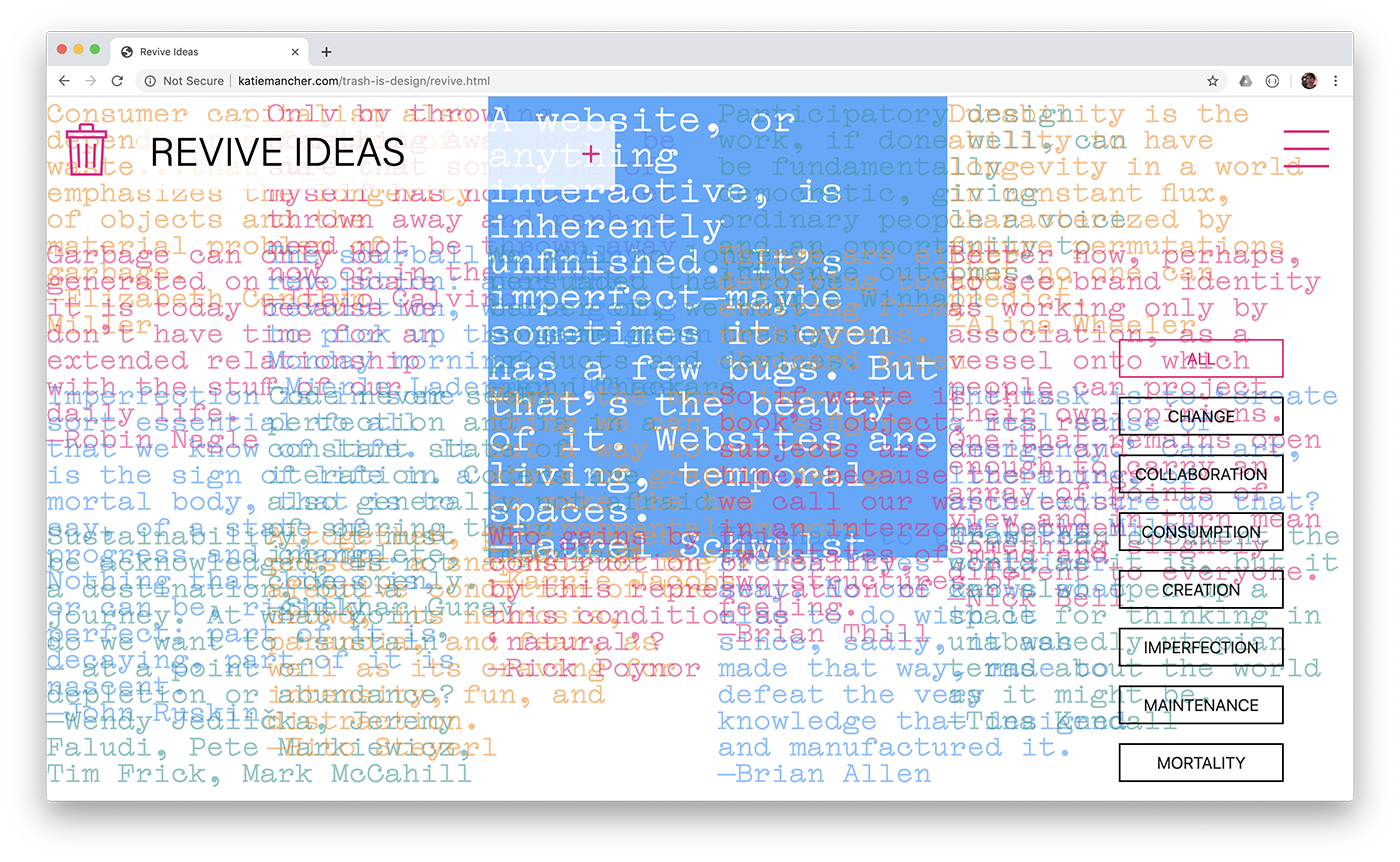
I designed this website to explore these ideas, to contain my “trash design principles,” and to serve as a resource that could live on outside the gallery. I used P5.js and CSS to create different interactions that would prompt users to see trash, and digital media, in a different way. This page layers quotes that I found useful in my research, revealing them when a user rolls over one or uses the buttons to filter.
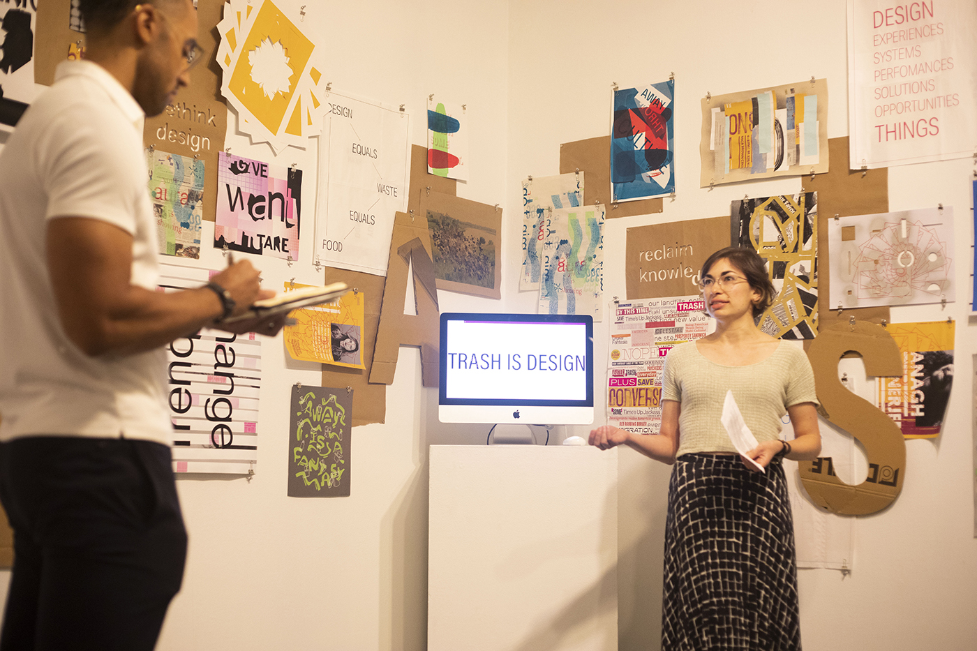
Presentation to thesis critic Silas Munro
