Typescapes
Daniel Frumhoff
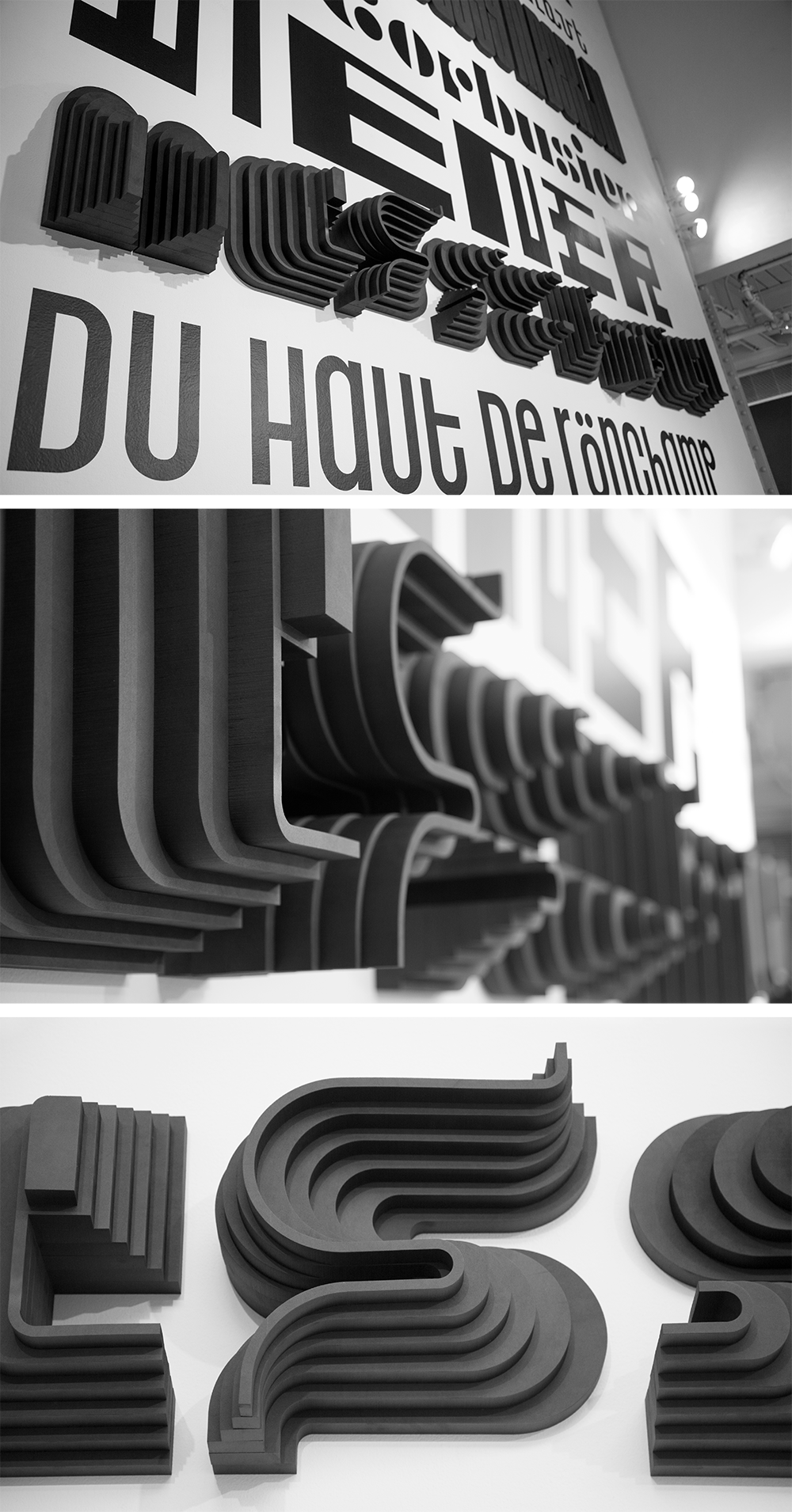
Typescapes is a series of typographic explorations inspired by architectural landscapes, plans, elevations, grids, light, and shadow. Grounded in architecture, each study has been developed into a typeface that embodies the formal qualities of a specific building.
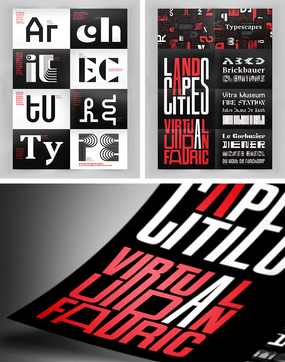
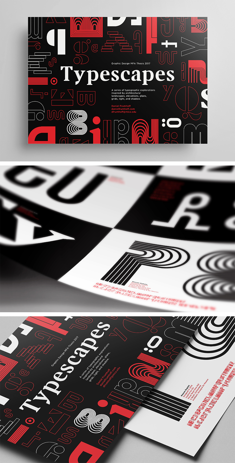
Type Specimen Takeaway
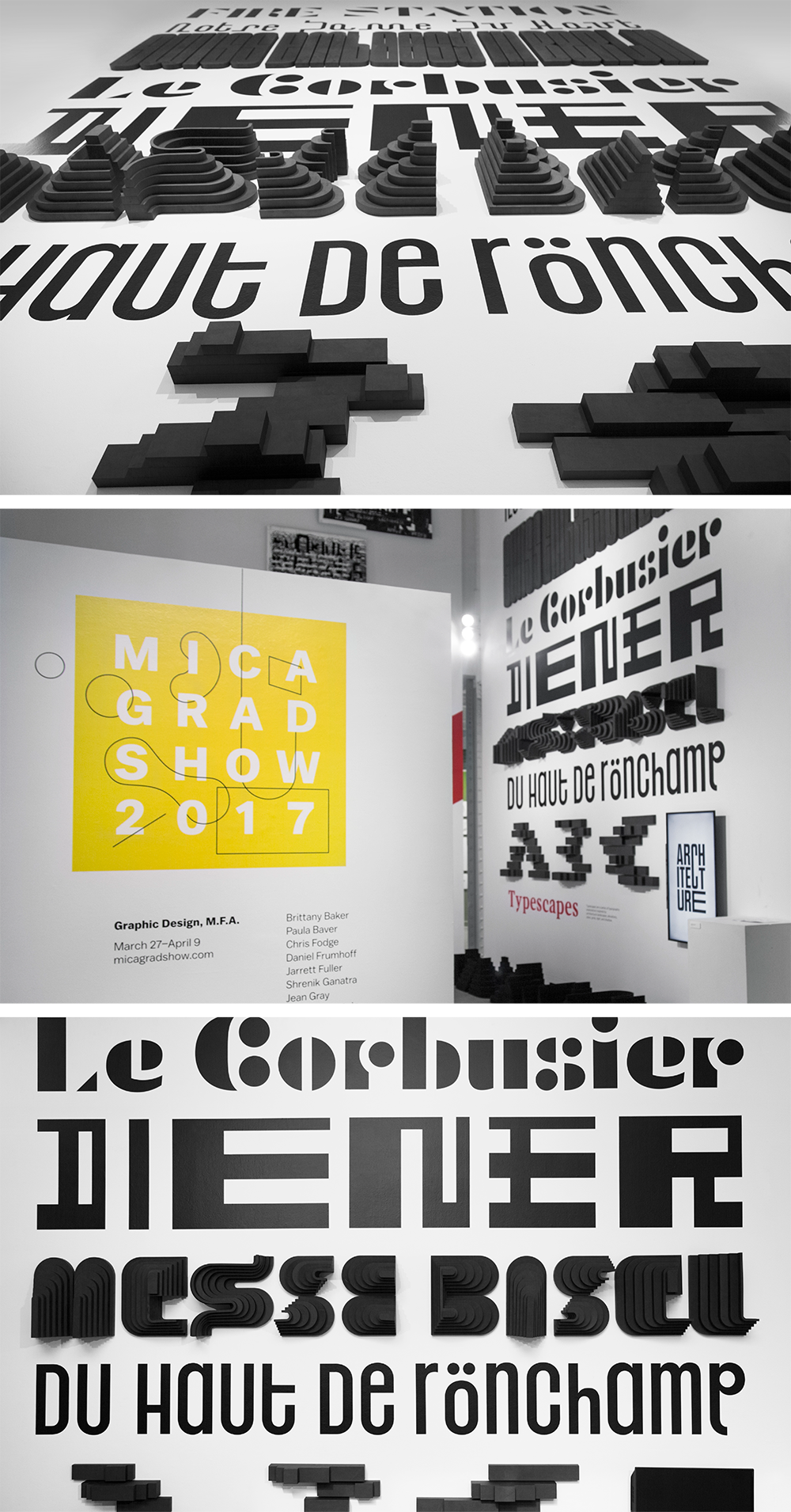
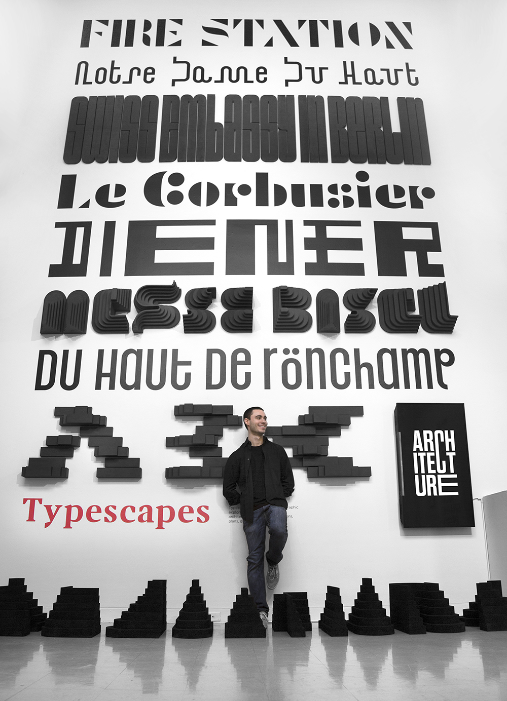
Typescapes: Thesis Wall
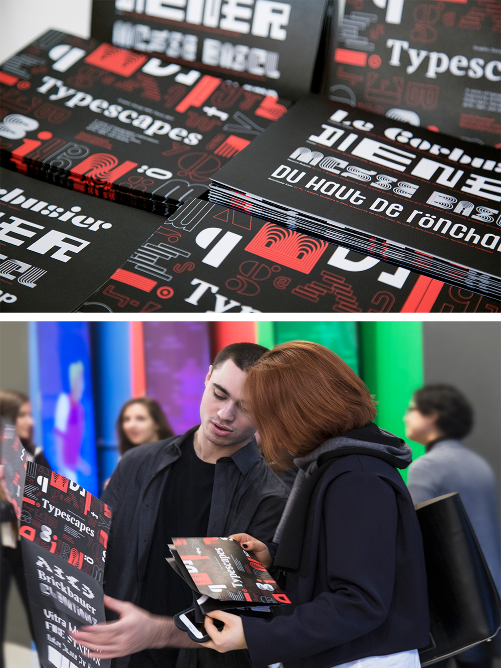
Type Specimen Takeaway
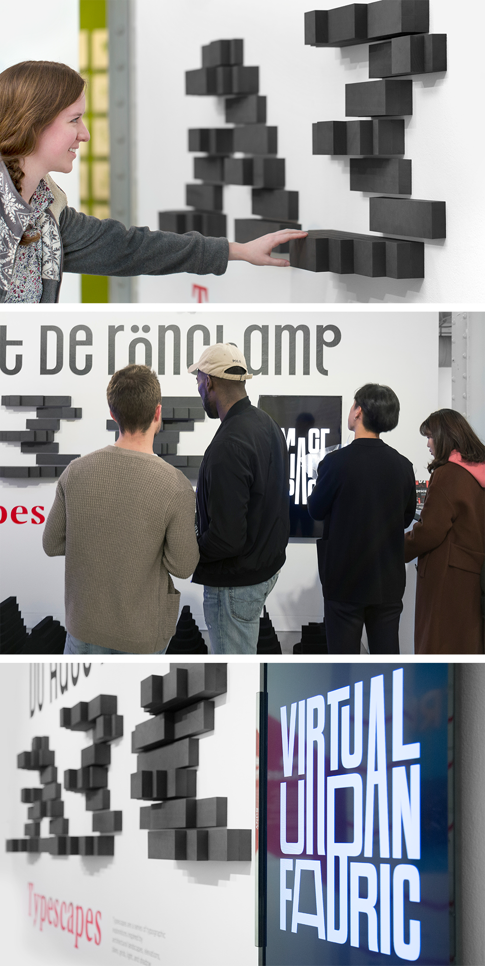
MICA Grad Show Opening Reception
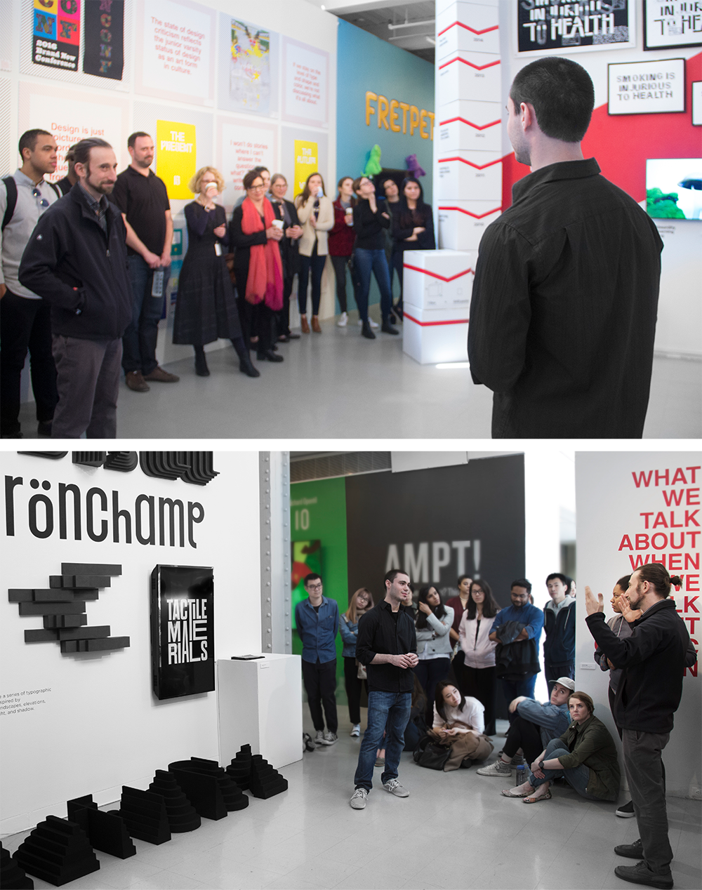
Thesis Gallery Talk
Thesis gallery talk with guest critic Abraham Burickson.
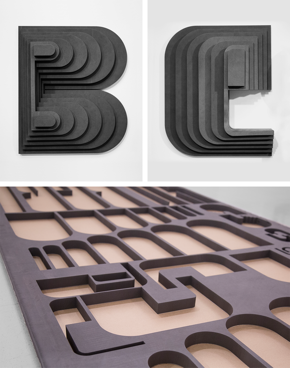
Meuron Letters B + E
Letters B and E from my typeface Meuron and the negative cutouts of the foam letters.

Meuron Bold
Meuron Bold. Designed in 2016. Inspired by the Messe Basel New Hall in Basel, Switzerland. Architect: Herzog & De Meuron.
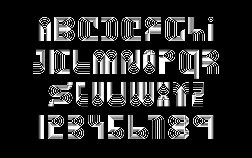
Meuron Regular
Meuron Regular. Designed in 2016. Inspired by the Messe Basel New Hall in Basel, Switzerland. Architect: Herzog & De Meuron.
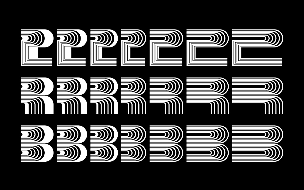
Meuron
Meuron typeface designed in 7 weights.
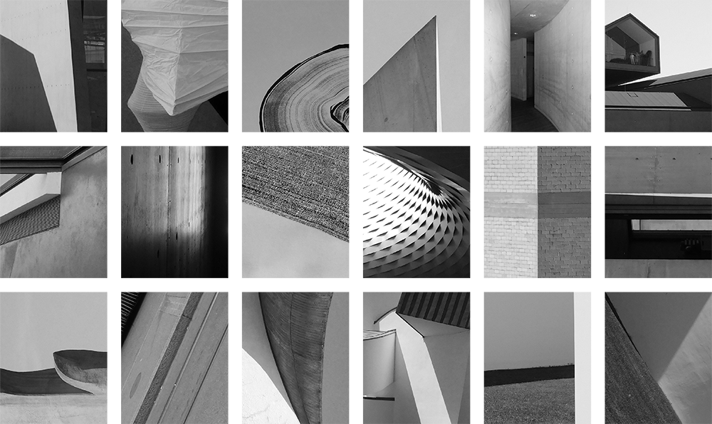
Architecture Studies
Architecture studies of light and shadow.
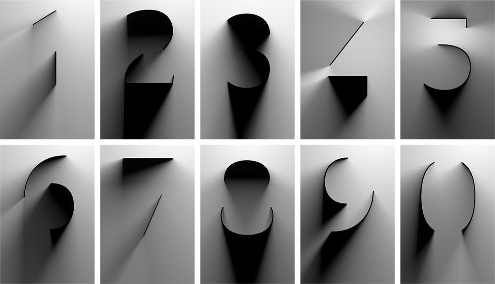
Light and Shadow Type
Light and shadow typeface design studies.
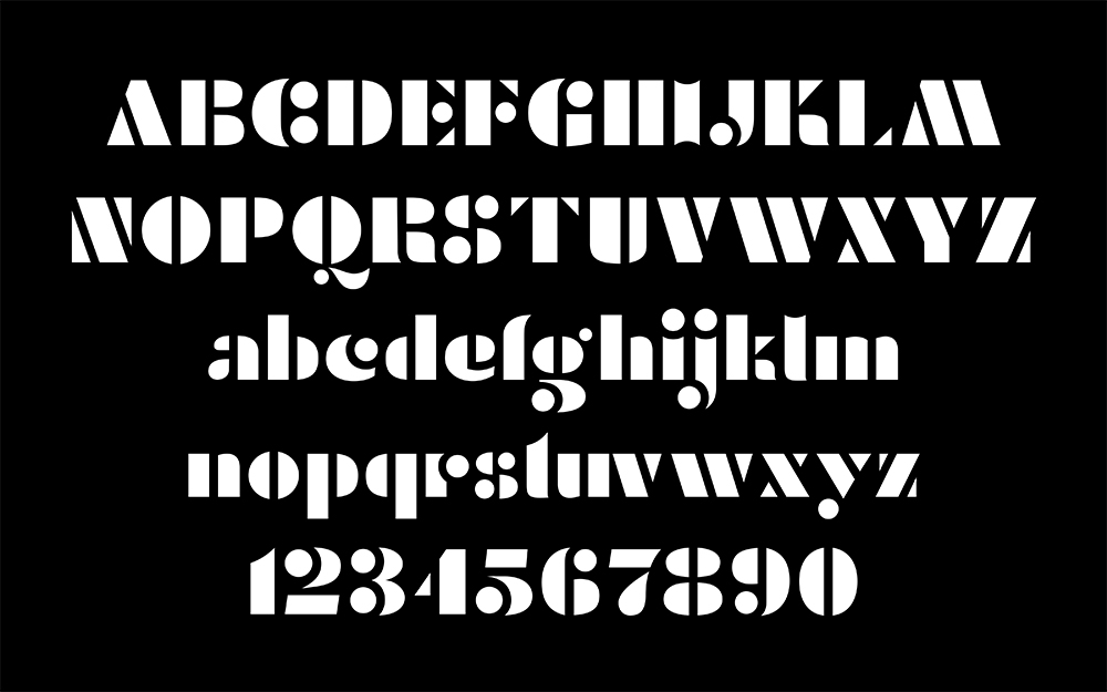
Corbusier Stencil
Corbusier Stencil. Designed in 2016. Inspired by Le Corbusier’s Charrette Typeface used in his plans, architectural drawings, and signage.

Fire Station
Fire Station. Designed in 2015. Inspired by the Vitra Fire Station in Weil Am Rhein, Germany. Architect: Zaha Hadid.
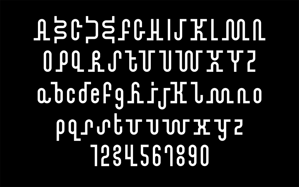
Notre Dame Display
Notre Dame Display. Designed in 2016. Inspired by the Notre Dame Du Haut in Ronchamp, France. Architect: Le Corbusier.

Brickbauer Medium
Brickbauer. Designed in 2016. Inspired by the Brown Center at the Maryland Institute College of Art in Baltimore, Maryland. Architect: Charles Brickbauer.
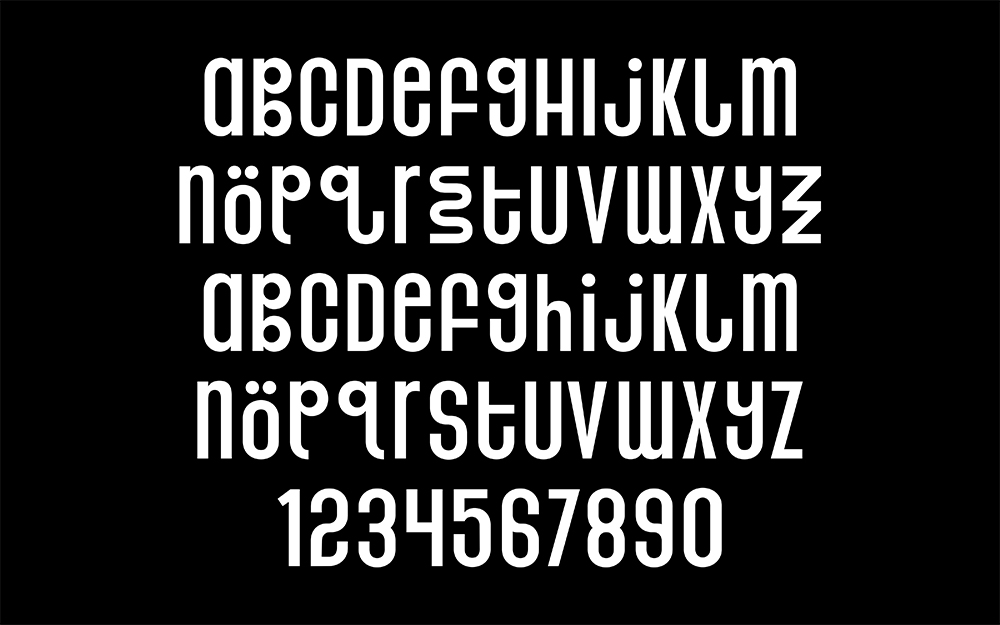
Ronchamp Sans
Ronchamp Sans. Designed in 2016. Inspired by the Notre Dame Du Haut in Ronchamp, France. Architect: Le Corbusier.
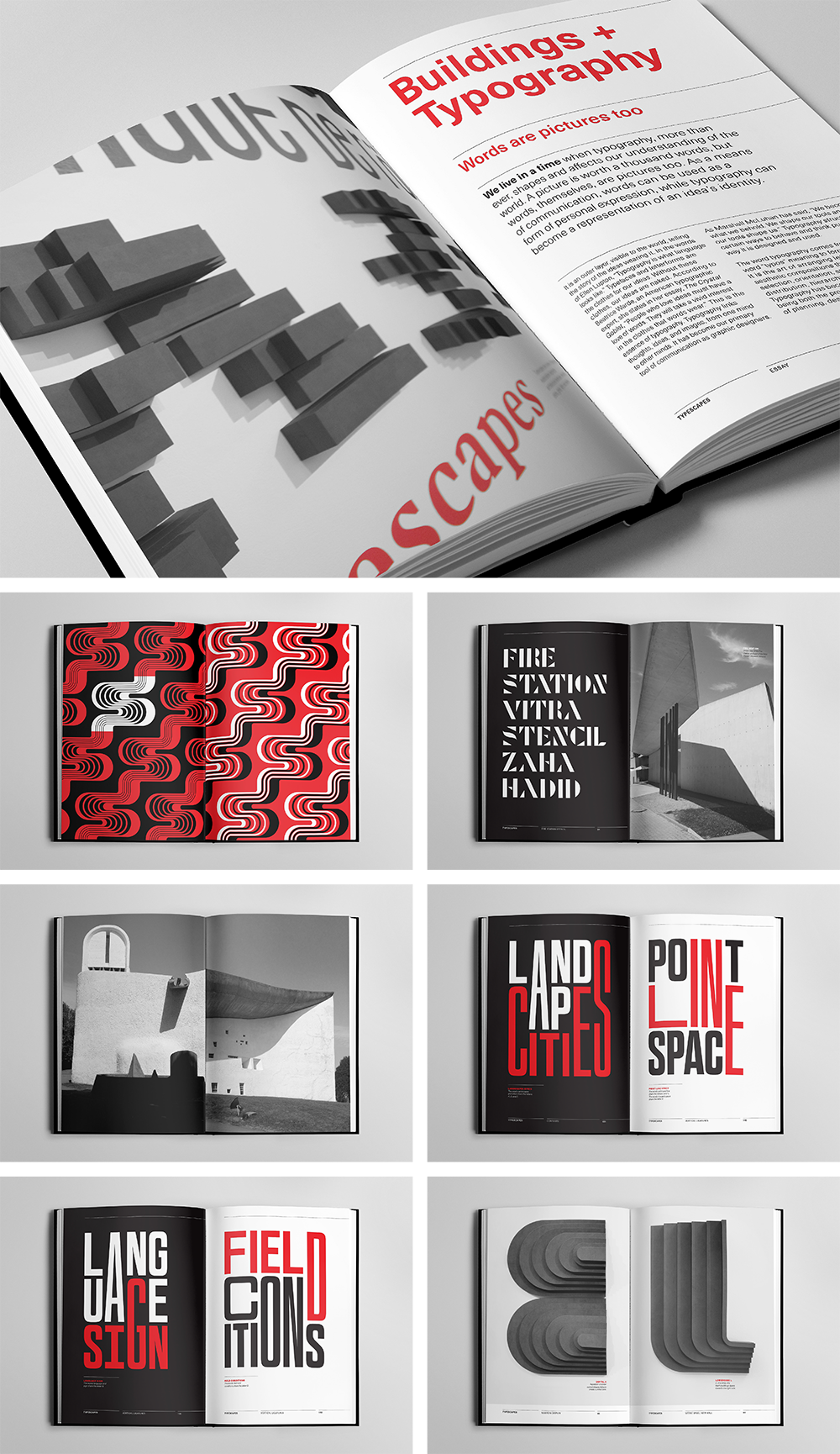
Typescapes Thesis Book
Selected spreads.
Thank You
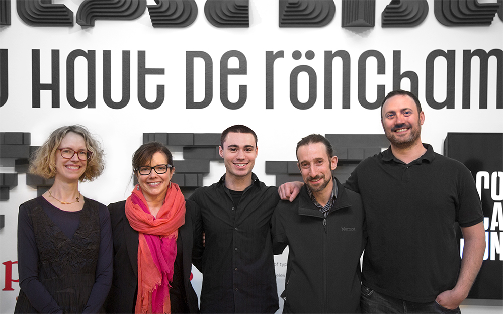
Thank you to my amazing mentors for their support and guidance! From left to right: Ellen Lupton, Jennifer Cole Phillips, Abraham Burickson, and Jason Mathews Gottlieb.
