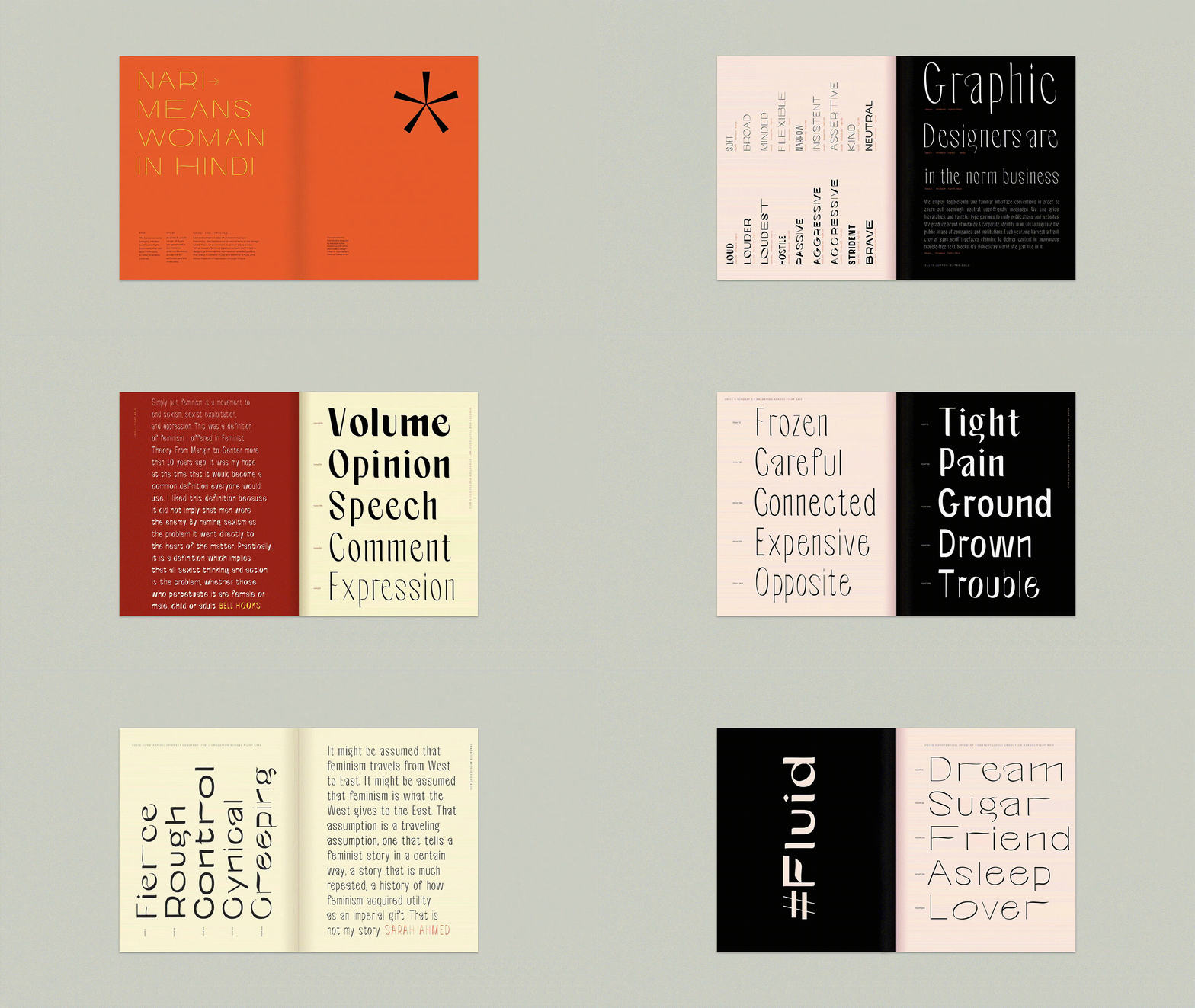
Nari is an experiment in variable font technology that attempts at answering the question, “what would it mean for a typeface to be feminist?”. The result is an interactive variable typeface designed by a woman of color, one that has multiple voices, that represent choice, expression, and inclusivity; does not belong to any one extreme, and is fluid in nature. It breaks away from the traditional “acceptable” proportions of letter design and is anything but neutral.
The three variables are voice(weight), mindset(width), and fight(contrast). Through a permutation and combination of these three variables, Nari—meaning woman in Hindi, can generate various different styles, similar to how a woman is a powerhouse of assuming different roles at given points of time.
Nari Variable
Challenging the notions of the neutral
Aasawari Kulkarni
Nari Variable
The three variables— voice (weight), mindset (width), and fight (contrast).
Nari Variable—Specimen
A specimen for Nari, explaining the three axes and the various styles.
Bridge The Gap
A series of anti-patriarchal posters, set in Nari
Discriminating
A series of anti-patriarchal posters, set in Nari
We are all the Other
A series of anti-patriarchal posters, set in Nari
Down with Typatriarchy
A series of anti-patriarchal posters, set in Nari
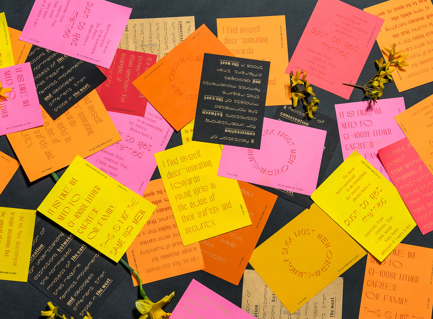
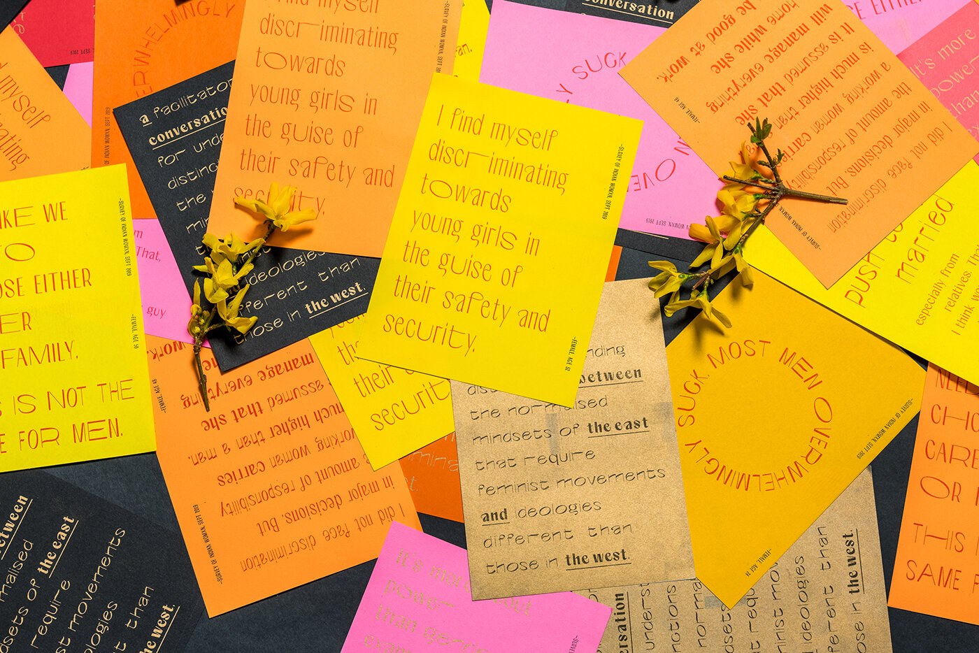
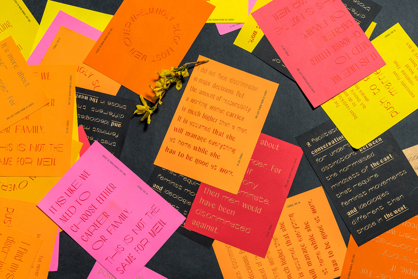
A Conversation Between the East and the West
A series of postcards, with stories of gender based discrimination from Indian women, giving a peak into what it’s like being a woman in India.
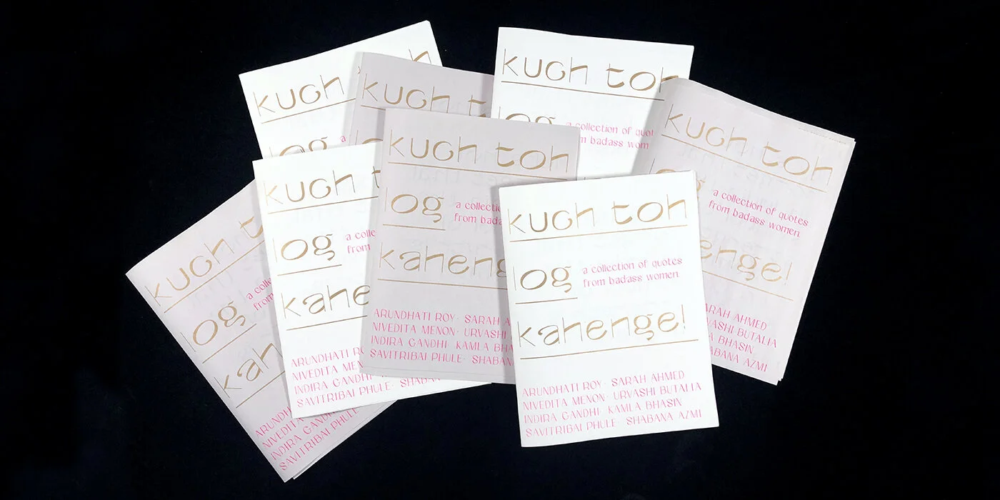
Kuch Toh Log Kahenge
A riso-printed feminist zine, kuch toh log kahenge—meaning “people will always have something to say”, is a collection of quotes from some badass Indian women.


